By Joel Friedlander
Welcome to the e-Book Cover Design Awards. This edition is for submissions during June, 2019.
This month we received:
49 covers in the Fiction category
11 covers in the Nonfiction category
Guest Judge
 I’m very pleased to welcome Cathi Stevenson to The Book Designer as a guest judge this month. Cathi is a freelance writer and book cover designer, who previously worked for a major newspaper writing and editing advertising features. Since 2000, she has been designing book covers through her BookCoverExpress.com website and has created more than 2000 covers for traditional and independent publishers. Her client list includes best selling authors who have appeared on Oprah, Good Morning America,The Today show, Entertainment Tonight and 48-hours. You can visit Cathi’s new site here: www.CathiStevenson.com.
Comments, Award Winners, and Gold Stars
I’ve added comments (CS: ) to many of the entries, but not all. Remember that the aim of these posts is educational, and by submitting you are inviting comments, commendations, and constructive criticism.
Thanks to everyone who participated. I hope you enjoy these as much as I did. Please leave a comment to let me know which are your favorites or, if you disagree, let me know why.
Although there is only winner in each category, other covers that were considered for the award or which stood out in some exemplary way, are indicated with a gold star: ★
Award winners and Gold-Starred covers also win the right to display our badges on their websites, so don’t forget to get your badge to get a little more attention for the work you’ve put into your book.
Also please note that we are now linking winning covers to their sales page on Amazon or Smashwords.
Now, without any further ado, here are the winners of this month’s e-Book Cover Design Awards.
e-Book Cover Design Award Winner for June 2019 in Fiction
Kit Foster submitted One Thousand Eyed Spies designed by Kit Foster.


CS: Although the author name is a bit small, it’s a clean font, so it’s readable. I like this book cover because it’s fresh, and the text is expertly incorporated into the artwork.
e-Book Cover Design Award Winner for June 2019 in Nonfiction
Michele DeFilippo submitted 90 Days to Live designed by 1106 Design.


CS: Love the colors. An excellent design.
Fiction Covers
Adam Boostrom submitted Athena’s Choice designed by Asha Houssain. “Literally not one person has said anything to me about this book cover other than: “I absolutely love it””

CS: If the cover is moving books, then there’s nothing I can add.
Boris Sanders submitted Code Stasis designed by Shashika. “Code Stasis is a collection of 4 Short Stories that don’t have much in common, with the exception that all of them show mysterious beings that are locked in crystals and influenced human history.”

CS: I can’t make out the sub-title. I’m also confused because online the title has a colon: Code: Stasis, and the meaning with the colon could be different. Is it referring to an actual code or to “code” in terms of a situation? Or do I just need a nap?
Catherine DePasquale submitted The Restoration of Michael Danvers designed by Mark Thomas / Coverness. “We found stock imagery of a model matching the 1940s setting of the book. The image was cropped, creating a sense of mystery and anonymity. The main font (Albertus) has a spiritual feel, keeping with the tone of the story. The colour scheme is browns and beiges, giving a retro feel.”

CS: I can’t tell what the book is about. Is it romance? Thriller? How did he get that stubble shaved so close and so evenly?
Cherie Mitchell submitted Lucy’s War designed by Cherie Mitchell. “I isolated and blew up a photo of an old chair, reversed the shot, added more shadows & light, and a rose. Simple but effective.”

CS: I think the cover would do fine in the market, but the use of the foot symbol instead of the quotation mark makes me twitch a bit (but that might be attributable to the nine cups of tea I’ve had today).
Dan Van Oss submitted The Greatest Game designed by Dan Van Oss – Covermint Design.

CS: The fonts work well together. The images are professionally executed. I would find some way to separate the series name from “Book 1.” Perhaps design a little logo or put “Book 1” underneath?
Dan Van Oss submitted Maverick Gambit designed by Dan Van Oss – Covermint Design.

CS: I like this. Strong use of fonts. They just don’t build spaceships like this anymore. ★
Darja DDD submitted Hunted designed by Milo from Deranged Doctor Design. “Urban Fantasy cover design, A Seventeen Series Novel Book 1”

CS: A cover well-suited to the genre. I like the emblem design. I hope he doesn’t inadvertently cross his hands though. Ouch!
Darja DDD submitted Warrior designed by Milo from Deranged Doctor Design. “Urban Fantasy cover design, A Seventeen Series Novel Book 2”

Darja DDD submitted Empire designed by Milo from Deranged Doctor Design. “Urban Fantasy cover design, A Seventeen Series Novel Book 3”

Darja DDD submitted Blood and Lies designed by Marushka from Deranged Doctor Design. “Romantic Suspense book cover design, Twisted Duet Book 1”

Darja DDD submitted Blood and Vows designed by Marushka from Deranged Doctor Design. “Romantic Suspense book cover design, Twisted Duet Book 2”
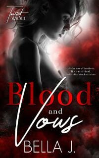
Darja DDD submitted When the Man Comes Around designed by Marushka from Deranged Doctor Design. “Mystery, Thriller & Suspense book cover design, Lawson Raines Book 1”

CS: I like the use of the italic font on this title. The design fits the genre very well.
David Jones submitted Billette Hall designed by MBLArt. “With this cover, I wanted to display the slaves running towards a plantation house. The man with the ax outlines the image as he is a mysterious character. He’s lurking and always around but, for the half the story, the escaped slaves unaware of him.”

CS: This cover is creepy and sinister. ★
Derek Shupert submitted Dead State: Fallout designed by Christian Bentulan.

CS: I like this cover. It might work better with a bit more color, but that’s just personal preference. ★
Derek Shupert submitted Dead State: Survival Road designed by Christian Bentulan.

Devin Cowick submitted Poseidon’s Storm Blaster (The Legend of Pineapple Cove 1) designed by Circe. “This cover depicts the scene when Kai and Delphi enter Poseidon’s Temple and find the artifact that can help save their island: Poseidon’s Storm Blaster. The border represents the magic portal to Poseidon’s Island. There is a hidden pineapple on the cover, just as there are throughout the book.”

CS: Love this. The title treatment is perfect for the genre. Nice illustration. ★
Diana Stevan submitted Sunflowers Under Fire designed by Jun Ares. “The image is of a family member portrayed in the story set in western Russia (present-day Ukraine). Sunflowers is the national flower of Ukraine. I sent the book cover designer a watercolour I did with the family member pasted on the scene. He put her on a chair with a field of sunflowers behind her”

CS: I think this design fits the genre nicely, and the added significance of the images makes that much more relevant.
Diane Prodger submitted And Then They Ruined Everything designed by C7 Design. “The symbol on the drum is a fermata-a musical “pause”. This is what happens when the book’s protagonists travel back and forth in time to great past musical gigs. The black-hooded drummer represents the angst-ridden main character who nearly wastes away.”

CS: Love the illustration. ★
Dillon McGaughey submitted Slotback Rhapsody designed by Dillon McGaughey. “Story is the smallest player on the football team trying to make an NFL roster against people who are miles ahead of him physically.”

CS: I like it, but for some reason it gives me a “nonfiction vibe.” Perhaps that was intentional.
Divine Michelle submitted Ink and Ivy designed by Divine of Yonderworldly.
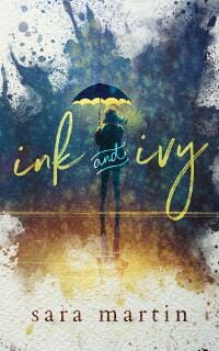
CS: Like the artwork, like the text treatment, but I have no idea what the book is about or what genre it’s in. A tagline might be useful.
Hampton Lamoureux submitted Faith Against the Wolves designed by Hampton Lamoureux.

CS: Nice. The text and image are very well done.
Hampton Lamoureux submitted Birth of the Bacchae designed by Hampton Lamoureux.

CS: Another strong design. The kerning and leading on the text are uniform and in proportion, which leads straight down to the author’s name.
Hampton Lamoureux submitted The Test: First Encounter designed by Hampton Lamoureux.

James Rock submitted Giant Killer Bats of Alamogordo designed by JC Rock.

CS: Love the nod to vintage pocket novels. Very well done.
Jeanne Moran submitted The Path Divided designed by Michael Rausch. “To compress the book’s dual narrators and dual timelines into one cover image, Michael Rausch depicts them (and a friend) at a decision point — should they choose loyalty to the Nazi party or should they choose the unknown?”

CS: I find the split word distracting and had to look quite a while to locate the rather large swastika. There’s too much going on. The title is also off center.
Joslyn Carter submitted Nobody Told Me I Couldn’t… designed by Elizabeth J Carter. “This e-Book cover depicts the participants and the title of this insect racing adventure in a vibrant hued and engaging action setting.”

CS: I like the energy, but I can’t read the title and can’t make out the author name at all. I think the cover would benefit from a bit more polish, including more vibrant colors, and a stronger feature image. Perhaps enlarging the main character significantly, while reducing the others would help. Right now I don’t really know where I’m supposed to focus.
Kit Foster submitted No Place to Call Home designed by Kit Foster. “The torn passports are intended to signify a lack of belonging.”

Kit Foster submitted A Spider Sat Beside Her designed by Kit Foster.

CS: Well executed. I didn’t notice the spider on the first pass, but clever.
L.C. Warman submitted The Last Real Girl designed by Caroline Teagle Johnson.

CS: I like this text trend, and I like the color and position of the graphic.
Lacey Impellizeri submitted The Devil’s Own designed by Damonza. “Thank you for hosting this!”

Linda Rae Sande submitted Stella of Akrotiri: Origins designed by Fiona Jayde Media. “For the prequel to Stella of Akrotiri: Deminon, which had a rich gold and red color scheme for its cover and featured the same cover models, we chose a more red-purple scheme and kept the same fonts and title placement. The volcano is the backdrop for the story.”

CS: The cover definitely stayed true to the series. A very nice vintage feel to the design.
Lori Swerda submitted Star-Spangled Scandal designed by iuniverse/self. “Based on the family of Francis Scott Key (hence the key) National Anthem author (hence the flag) Based in Washington DC in early 1800’s (hence the cobblestone!)”

CS: The different fonts aren’t working well together, and the kerning needs a bit more attention. I’d include the text “A Story About Francis Scott Key and the National Anthem” or something to that effect, instead of using that stretched key.
Madeleine D’Este submitted Women of Wasps and War designed by Deranged Doctor Design.

CS: A very eye-catching cover.
Michele DeFilippo submitted 8 Seconds to Midnight designed by 1106 Design.

CS: Excellent cover design.
Monique McDonell submitted Playing Doctor designed by Sarah Paige, Opium House Designs. “This is a stand alone romance novel in a multi-author series set in a fictitious Cinnamon Bay, North Carolina.”

CS: I like the cover for the genre, but too many fonts.
Nathalie M.L. Römer submitted Hidden designed by Nathalie M.L. Römer. “The image represents an outward appearance in contrast to what readers discover about the protagonist in the story. The font is AdornS Condensed Sans from Adobe. I used blue for the title as this colour represents health and trust and the brown reflects the story of friendship I wrote for the book.”

CS: A stronger title treatment, or more contrast might help. I’m not a fan of floating heads. I’d bleed her off the botoom, and go with another background color.
Patrice Williams Marks submitted Counter Punch designed by Patrice Williams Marks.

Rachel Morris submitted Back in 5 designed by Rachel Morris. “Adapted from century-old police mugshot, representing characters who disappear and/or are abused. Digital collage with vintage and modern found elements, using apps Union, TinType, Image Resize, and Pixlr oniPad Pro. As the book is set in Wales, I used the Welsh flag palette.”
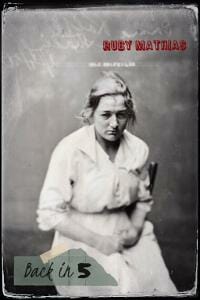
CS: It’s not traditional, and the designer dared to do something different. I like it. I’d buy this book. I’m not sure it works as a thumbnail though, so for an e-book cover contest not the right submission, but I bet it looks great in print.
Randall Floyd submitted The Endless Cave designed by Randall Floyd. “Middle Grade fantasy novel. Third book in the Mythic Beasts Chronicles series.”

CS: CS: None of these work for me, but they might work in the genre. The glare from the neon colors on my screen makes them all very difficult to read.
Randall Floyd submitted The Gryphon Code designed by Randall Floyd. “Middle Grade Fantasy Novel. Book 4 in the Mythic Beasts Chronicles series.”

Randall Floyd submitted The First Encounter designed by Randall Floyd. “Middle Grade fantasy novel – ages 8-13. Second book in the series.”

Rick Holland submitted Covert Crossings designed by Rick Holland. “A Great Lakes boater and his wife are forced to ferry terrorists into the United States in this terrorism thriller. This is a straight forward cover meant to capture the threat that is posed in this story.”

CS: Strong design. Works well.
Robin Mclain submitted Tales After Dark designed by Robin Mclain. “Ghost and Horror short stories, I like the contrast of the colors on the cover I feel it is a good image for a ghost horror genre.”

CS: This had potential, but the horizontal title font combined with the vertical font used in the author name are distracting.
Sue Campbell submitted The Coins designed by Sue Campbell Book Design. “MC is given four coins & some sage advice. The color, tribal pattern, and baobab trees evoke a hot African day. The sun represents the coins. The typography is subtle to let the imagery shine.”

Sue Campbell submitted The Maple Leaf designed by Sue Campbell Book Design. “The images represent two main characters—how their lives diverge and reconnect—the boys met at Maple Leaf school during an era of forced school integration.”

CS: Excellent cover design.
Tabatha Shipley submitted Projection designed by Abeni Trotter. “The desire here was to create a cover that features some kind of tech as the focal point. That, combined with the red shapes along the bottom of the cover, the broken glass, and the hazard symbol all give you the impression something is wrong. We wanted the reader to be intrigued by the chaos.”

CS: I don’t know what the book is about or what’s going on here.
Willow Thomson submitted Seeds of Change designed by Artwize (neptunianroadie on 99 designs). “This cover reflects the mix of genres and themes represented in this book—soft science fiction with metaphysical elements and an ecological theme.”

Nonfiction Covers
Doug Walsh submitted The Walkthrough: Insider Tales From a Life in Strategy Guides designed by Scarlett Rugers. “I spent 18 years as one of the most prolific authors of video game strategy guides. The pixelated controller tethered to a book conveys this quickly. “A Memoir Taken Further” is a nod to my former publisher, who used that font/color with the slogan “Take Your Game Further”.”

Elena Newton submitted Team Relationship Management: The Art of Crafting Extraordinary Teams designed by Elena A Newton. “TRM is a new business category and is referred to regularly throughout the book. The black against white: 1) yin / yang: the art and science of team relationships. 2) the marbled area signifies “crafting” and the “art” of teams, and represents the curve of a sculpture (horse, woman, vase).”

CS: Some clever elements.
JP Mac submitted They Took My Prostate: Cancer-Loss-Hope designed by D.C. Richter. “I wanted something conveying the disturbing experience of cancer surgery and described a scene to D.C. She came up with the 50’s sci-fi graphics, the color and the eerie looming perspective of the surgeon.”

CS: I appreciate what you’ve attempted here, but no! It looks too much like satire or comedy.
Kit Foster submitted Sun, Sand and Single designed by Nancy Gray.

CS: I don’t see the comma after Sun on the cover, it’s a nice design though.
Kit Foster submitted The Astrological History of the World designed by Kit Foster.

CS: I really like this, but find the title and sub-title look too cramped. I’d give those glyphs a bit of space.
Nancy O’Hare submitted Searching for Unique designed by Ingrid Paulson. “Searching for Unique uncovers unique destinations for travellers who prefer to escape the tourist crowds. My husband, Chad O’Hare, took the cover photo overlooking the temples of Bagan, Myanmar. The misty atmosphere nicely captured the mystique of far-off places described in my book.”

CS:Something a little different in terms of layout that makes the cover stand out, while not reducing its impact at smaller sizes. ★
Sue Campbell submitted It’s A Duck. And It’s Dead! designed by Sue Campbell Book Design. “Memoir in funny anecdotes—in the vein of “kids say the darnedest things.””

CS: Rest in peace, ducky.
Susan Stitt submitted Reforming American Politics designed by Rick Nease. 
CS: Too much valuable real estate being given to a common stock image. The title is long and challenging, and I think it could have been afforded a bit more space and had more focus placed on it. It’s all very blocky.
Tom Flanagan submitted The Potato Puff Surprise designed by Patrick Caldwell. “The cover design is a sketchnote of the story. Every item illustrated on the cover is included in the story, including the school in the background. Of course, I’m biased, but I think the cover artwork is really clever.”

Wageedah Salie submitted Music & Money designed by Wageedah Salie – One Story Creative. “All colors, fonts and style was chosen to feed into Danelle Harvey’s existing brand and with a mission to reach her target audience – female leaders in the music industry”

CS: I get where the design is going, or at least I think I do: It’s aiming for elegant, but I find the colors too soft. I’d like to add that while I realize this is a cover design contest, the title plays a big role in what the cover looks like, and that sub-title is quite challenging for layout. It should also be an em dash, not a hyphen in the sub-title.
Well, that’s it for this month. I hope you found it interesting, and that you’ll share with other people interested in self-publishing.
Use the share buttons below to Tweet it, Share it on Facebook, Link to it!
Our next awards post will be on August 26, 2019. Deadline for submissions will be July 31, 2019. Don’t miss it! Here are all the links you’ll need:
- The original announcement post
- E-book Cover Design Awards web page
- Click here to submit your e-book cover (See New Submission limits)
- Follow @JFBookman on Twitter for news about the E-book Cover Design Awards
- Check out past e-Book Cover Design award winners on Pinterest
- Subscribe to The Book Designer Blog
- Badge design by Derek Murphy
The post e-Book Cover Design Awards, June 2019 appeared first on The Book Designer.


